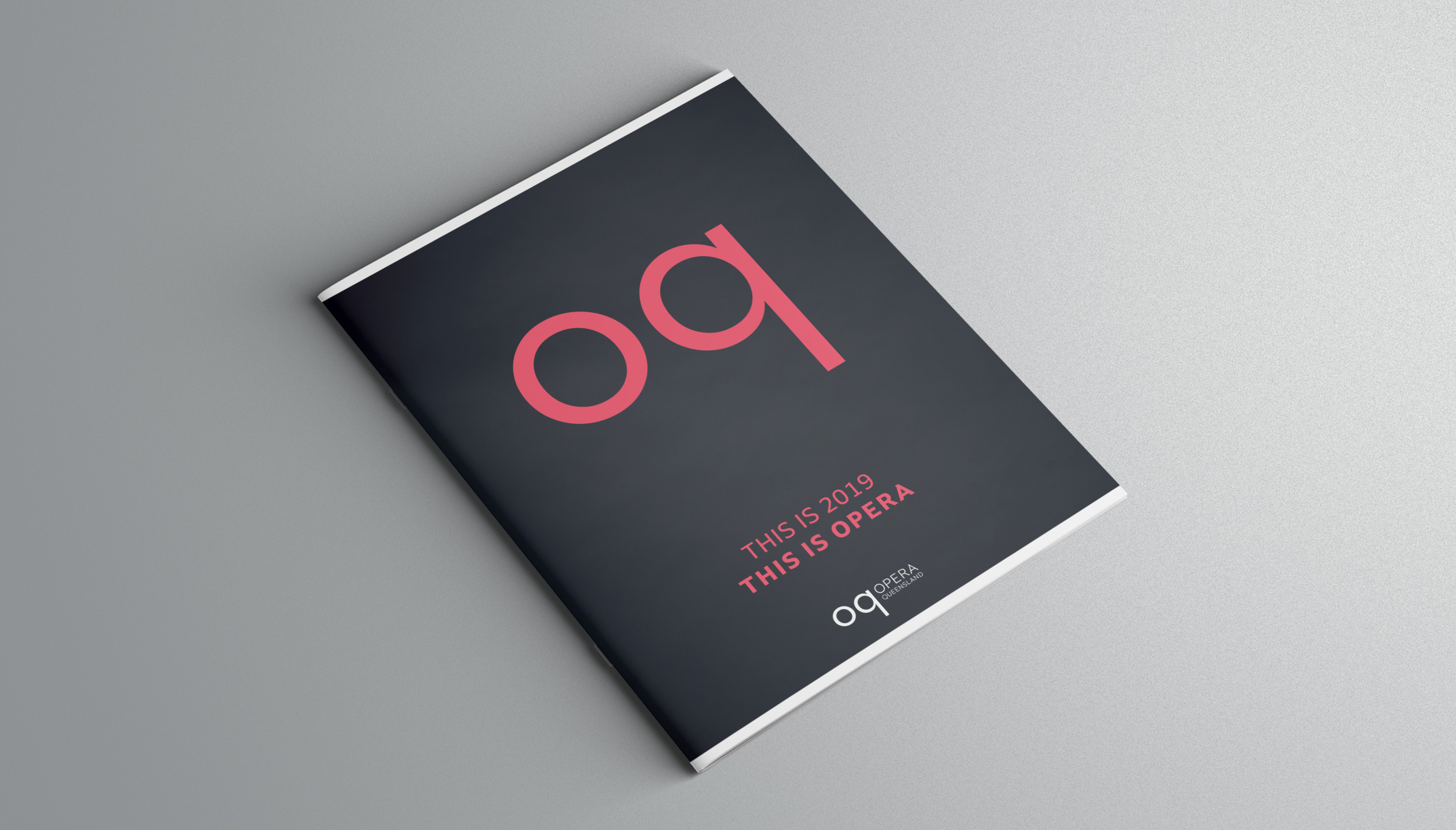
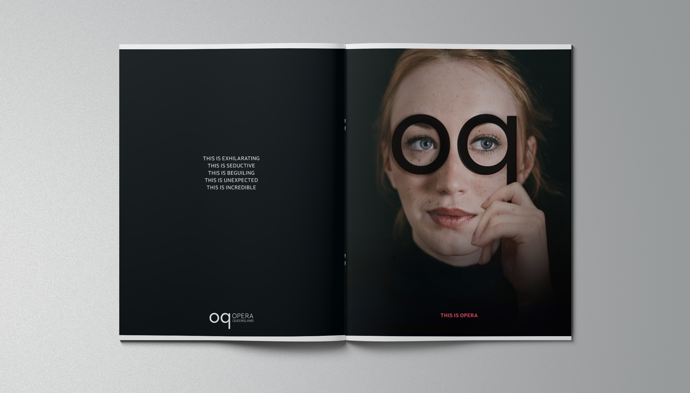
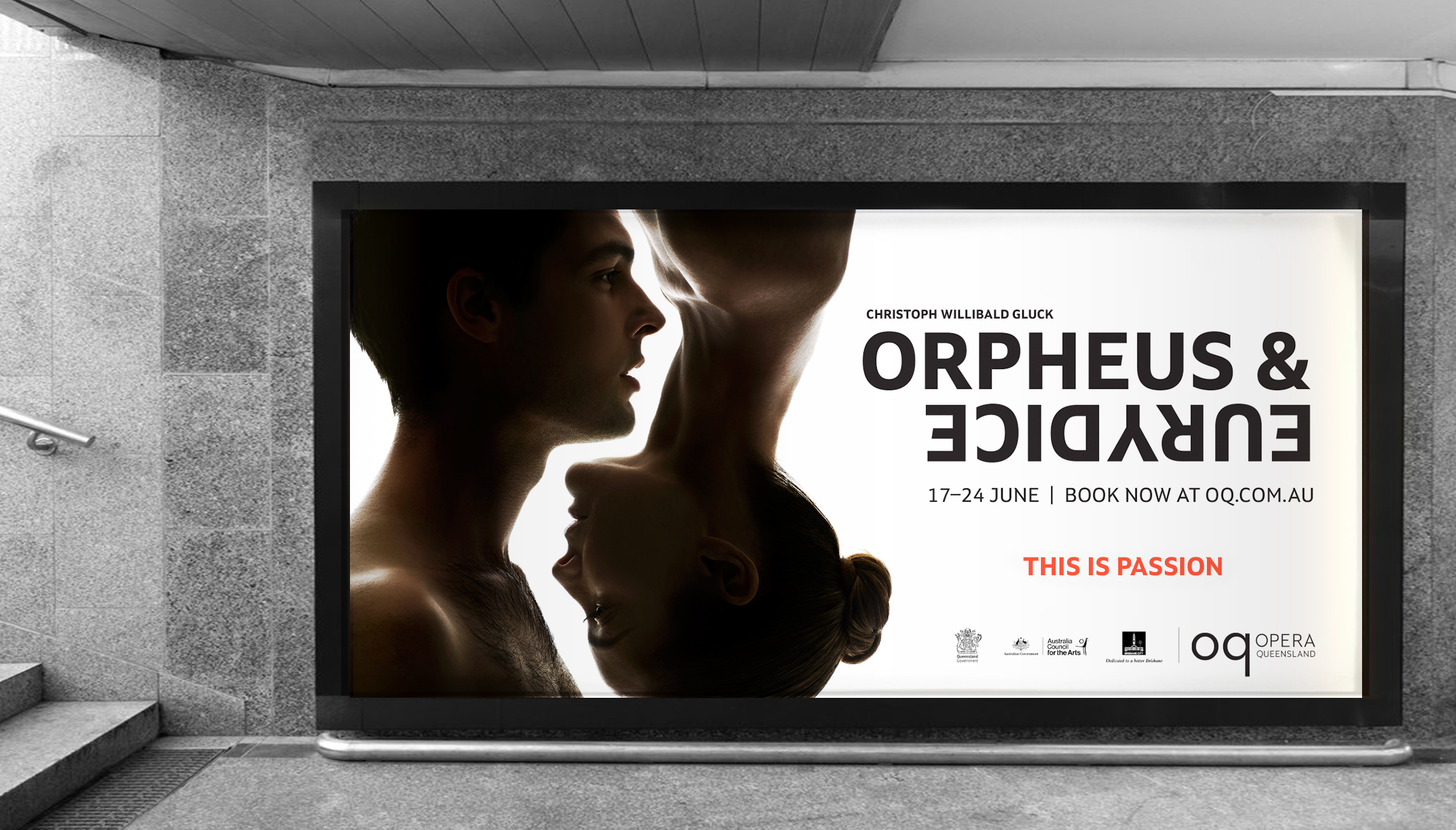
Alphabet worked with Opera Queensland (OQ) for their rebrand and subsequent promotion of their 2019 Season. Core to the identity refresh was the aim to attract a more diverse audience and to challenge and reinvigorate traditional perceptions of opera – while also retaining their existing patrons. The lower case oq letterforms play with the idea of opera glasses and seeing the art through a contemporary and unexpected way. The custom brandmark provides a balance between confident, classic and clean. The ‘this is opera’ Campaign was featured across digital billboards, outdoor signage and season print materials to introduce the new brand and message across Brisbane.
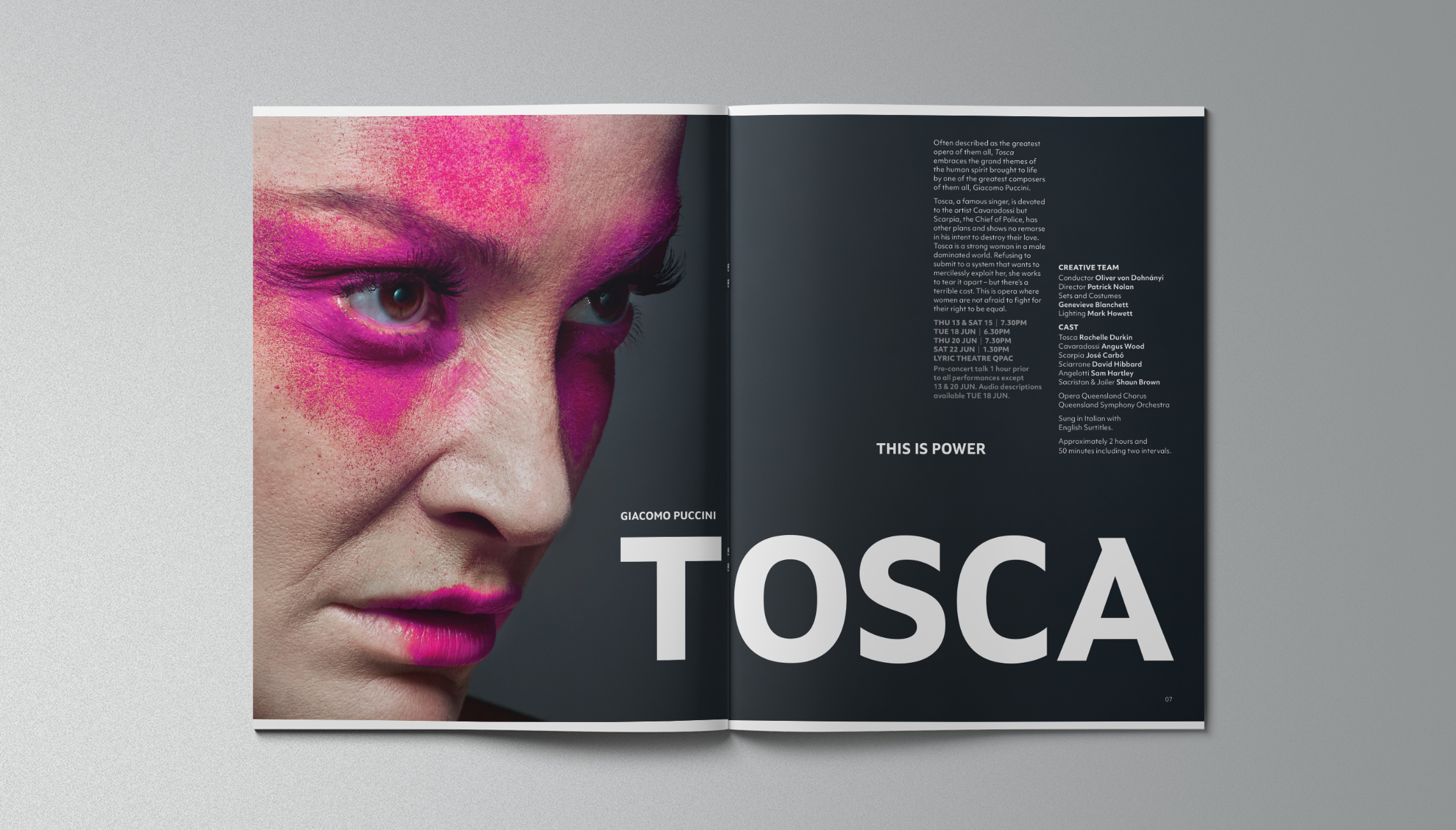
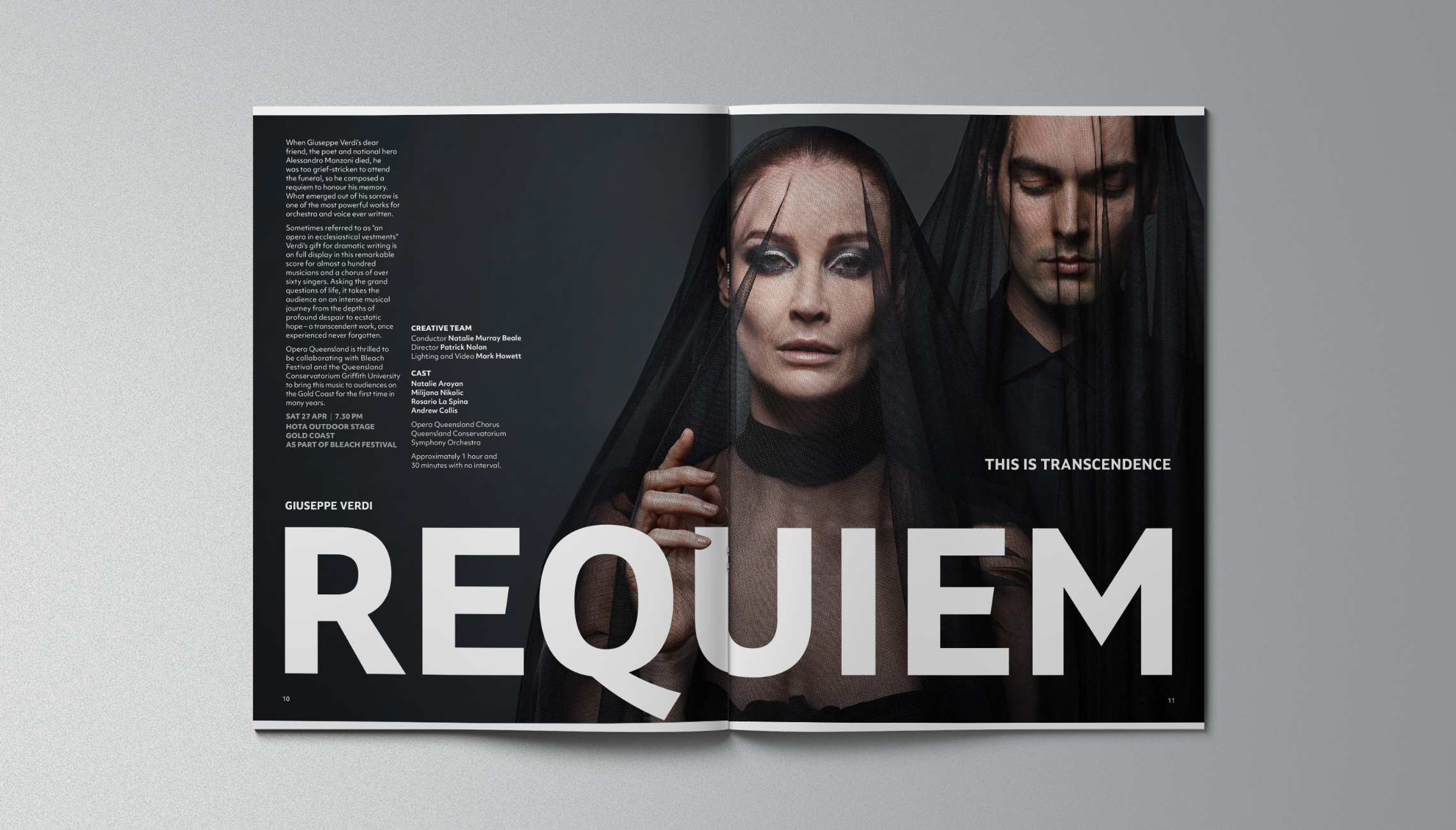
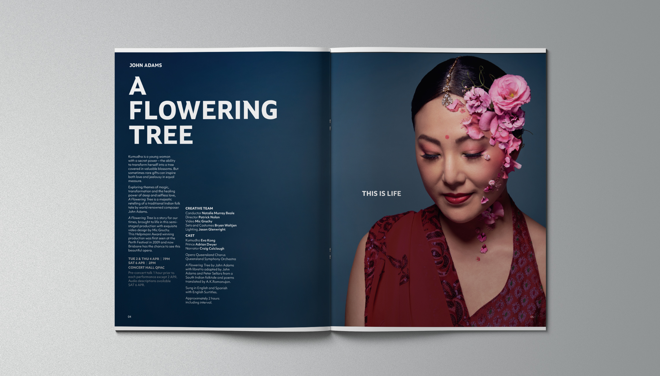
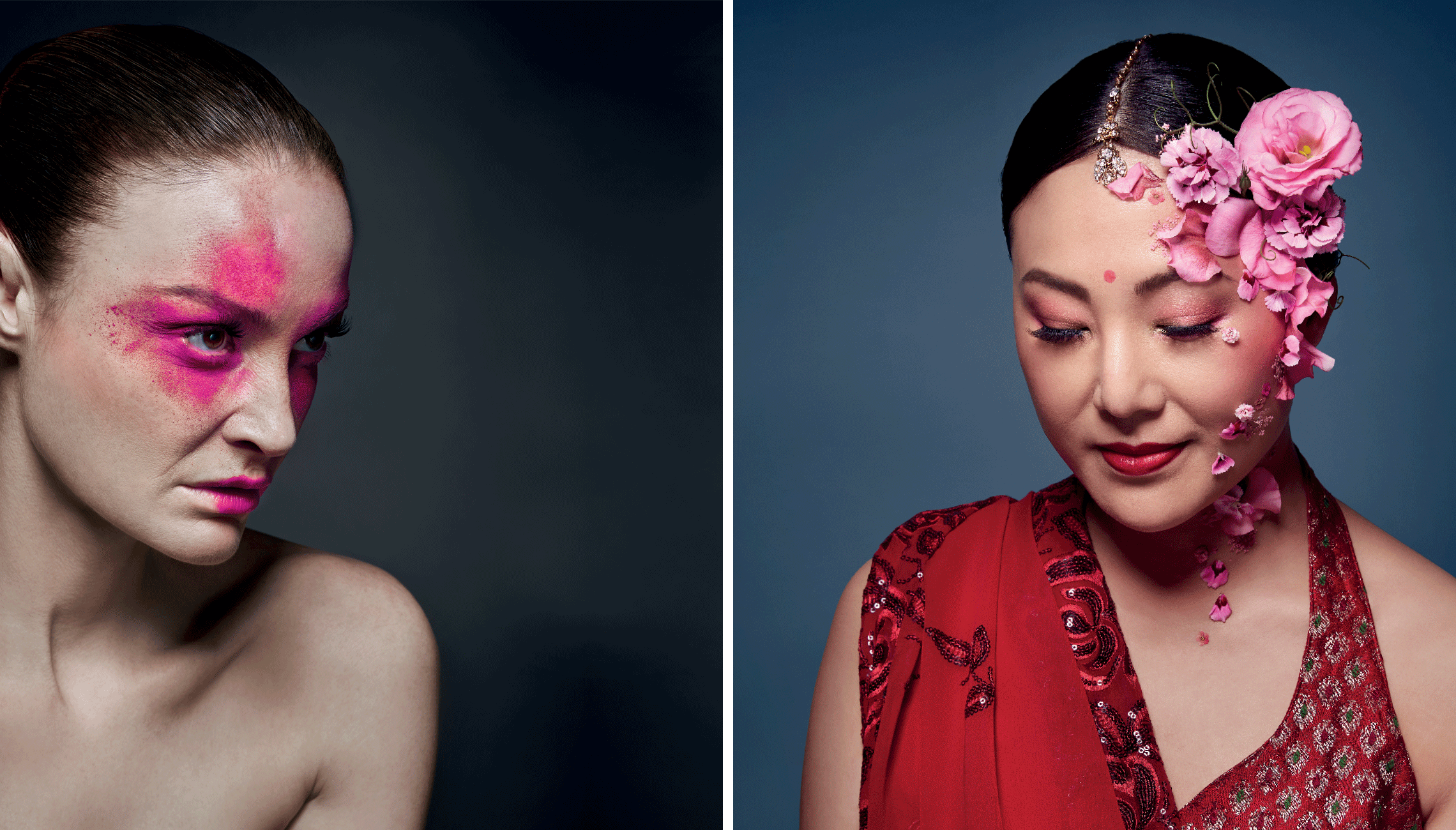
The 2019 Season book extends on the brand typography and language. Art direction reflects the contemporary and innovative production of classical, well known operas. Production imagery captures the elegant, striking and evocative tone of the operas.
Produced at alphabet studio. Photography by Paul Blackmore.